ScoopEase –
Ice Cream UI Concept
Discover the Flavor. We Design Experiences.
12 August 2025
.709e604e.png&w=3840&q=75)
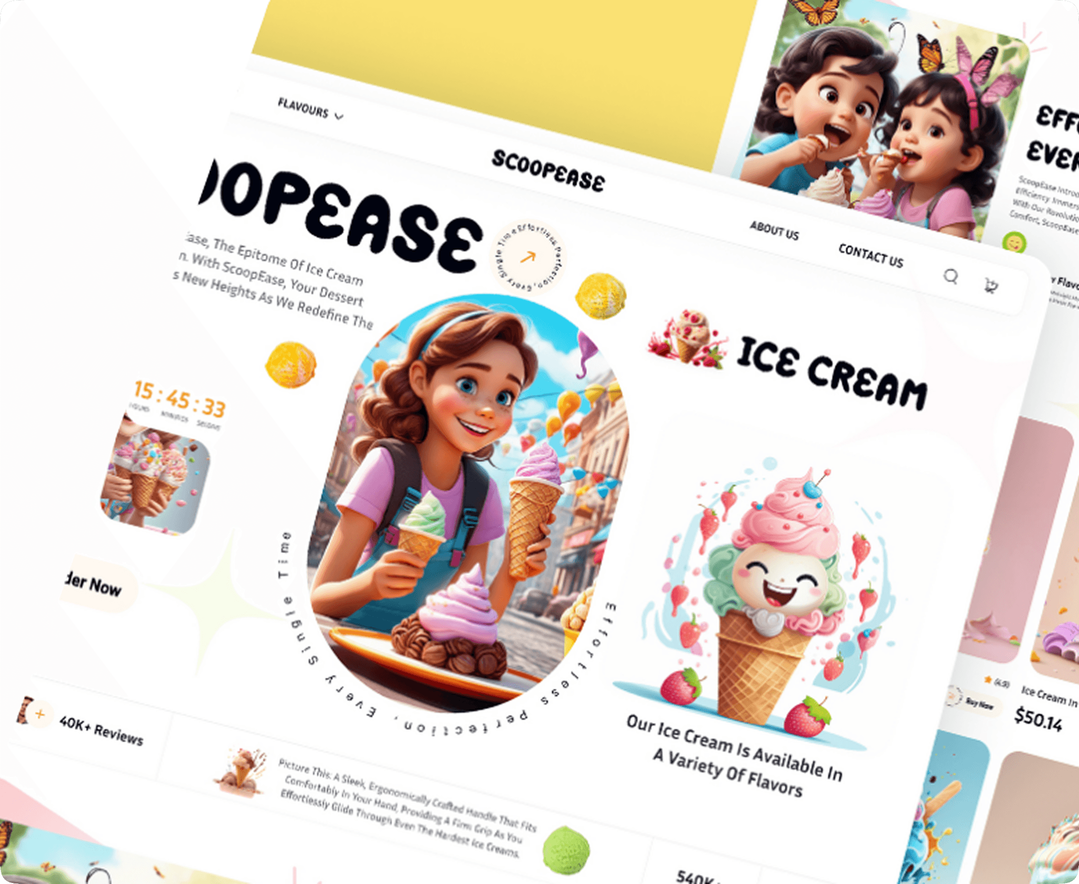
Project Overview
Designing for a lifestyle brand, ScoopEase needed more than visuals — it needed to convey fun, flavor, and freshness while staying intuitive for everyday users. The result elevated ScoopEase from a simple ice cream shop to a digital-first experience where customers feel excited and connected to the brand.
The Problem
In today’s fast moving digital landscape, ice cream brands struggle to capture attention and keep customers engaged online. While the product itself is fun and indulgent, many digital platforms fail to reflect that same excitement resulting in experiences that feel flat, outdated, and disconnected from modern customer expectations

Flat, uninspiring interfaces that fail to reflect brand personality.

Customers abandoning the site because flavor exploration is too difficult.

Limited opportunities to engage with seasonal or trending products.
.4a9125a3.png&w=3840&q=75)
The Solution
Our ScoopEase UI concept solved these issues with a delight-first design approach.

For the Brand
Introduced bold, playful visuals and immersive storytelling. Seasonal highlights and limited-time campaigns were seamlessly featured to keep the brand relevant.
.356313c4.png&w=3840&q=75)
For Administrators
A simplified dashboard made inventory management, promotions, and campaign tracking effortless. New campaigns could be launched quickly with a flexible CMS.
.49711d63.png&w=3840&q=75)
For Customers
Smooth navigation enabled users to explore flavors by mood, season, or popularity. Gamified interactions and animations encouraged repeat visits and deeper engagement.
Take a Look of Our Design Impact
.b9b533da.png&w=3840&q=75)
By addressing both sides of the brand experience, the design achieved.

Customers explored 2x more flavors per session compared to the old design.

Seasonal promotions saw a 35% higher engagement rate.

Admin teams launched new campaigns in half the previous time.

ScoopEase was repositioned as a modern, joyful, customer-first brand.
